Threads Logo Decoded: While Netizens Claim It To Be Malayalam Letter Or Even A Jalebi, The Actual Design Is Blatantly Simple
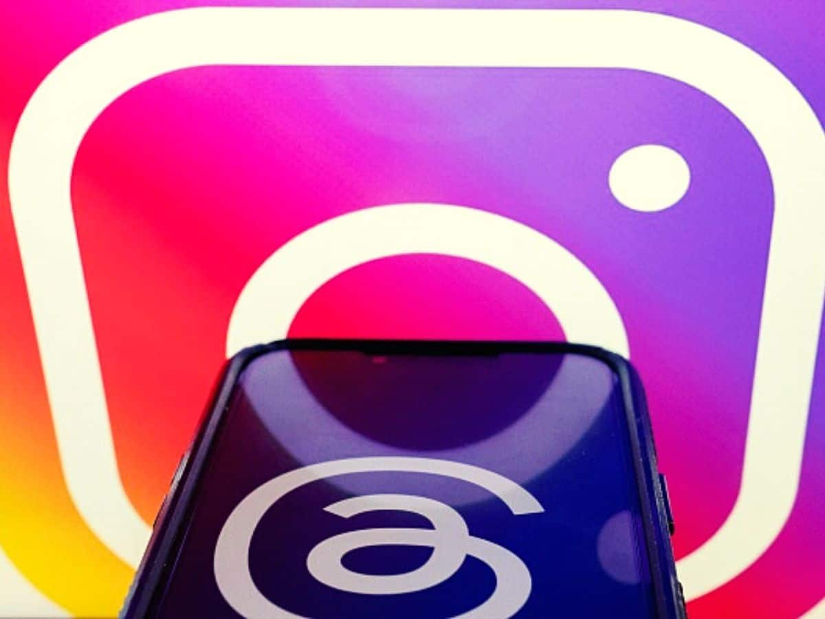
To be able to decode the meaning of the Threads logo, we simply need to remember that it is an Instagram-integrated app before anything else.

Threads, the microblogging platform launched by Meta-owned Instagram, certainly created a massive buzz upon its much-awaited debut on July 6. Within just a day, it surpassed 55 million users and even invited a lawsuit from its biggest rival, Elon Musk-owned Twitter. Netizens, however, seemed divided on a completely different matter — what does the Threads logo actually mean?
Indian users readily took to social media to draw attention to the fact that the Threads logo is actually a “90-degree clock-wise rotation” of the Malayalam letter ത്ര, which is pronounced as ‘thra’.
Is it me or does anyone feel that the logo of the upcoming Threads app appears like the 90-degree clock-wise rotation of the Malayalam letter ത്ര (pronounced as 'thra') rhyming with 'thr' in Threads. #Threads #ThreadsApp #Meta pic.twitter.com/PbfbQZu73l
— Shosanna (@the_shosanna) July 4, 2023
Some other users also surmised that the Threads logo looks like the Tamil alphabet கு, pronounced as ‘ku’.
Is it just me or does the logo of threads look like the Tamil alphabet 'Ku'🤔🤔 pic.twitter.com/16a0IOnotV
— Sukanya Ramanujan (@sramanujan) July 6, 2023
For some others, the Threads logo resembles the letter 'u' in Odia, written as ଉ.
Of course, foodies automatically zeroed in on the blissfully delectable jalebi, and it’s hard to blame them.
threads logo looks like jalebi fr! pic.twitter.com/qELl5EBynm
— Suchit Deshmukh (@suchit_d) July 6, 2023
Dedicated tech-heads would rather argue that the logo of Threads only reflects the latest trend among technology brands, where logos and overall stylings are slowly adapting retro designs marked by heavy minimalism. Carl Pei’s Nothing is perhaps one of the best examples.
Well, since Meta has not provided any details on what the Threads logo actually means, we wish to point out that none of the above is actually true, and the actual funda behind the design is rather simple, capturing the essence and identity of the app like no other.
Threads Logo Is Just The Instagram Logo… Stylised
Let’s put the two logos close to each other to understand that better. 
As we all know, the Instagram logo is actually a vintage Instax-style camera (notice the lens-like circle and flash on top?).
Now, Threads is an Instagram-integrated app. For starters, you cannot use Threads without having an Instagram account. So, it only makes sense that the overall design of the Threads logo will show its connection to the Instagram logo itself.
Keeping that in mind, look at the Threads and Instagram logos together. Check the photo above once again. Are you starting to see the resemblance?
Additionally, if you have already used Threads, you must have noticed the strings-like design dominating the app’s UI. The logo is actually designed with a single thread in mind, denoting the ethos of the app. So, a callback to the Instagram logo, as well as sticking to the threads-inspired design. And of course, the Threads logo is also a shoutout to the good-ol' @ symbol, which is associated with user IDs across nearly all notable social media platforms.
We see what you did there, Meta!
Having said all that, there has been no confirmation from the developers on the design, so readers are requested to consider this article with a pinch of salt!
Before You Go
Apple creates a new record in iPhone sales after launch of iPhone 16 | ABP Paisa Live
Top Headlines


