From iMac To iPhone: 6 Stunning Apple Products Designed By Jony Ive That Changed The World
Some of the devices Ive designed at Apple took the tech world by storm and went on to change the course of how we see, use, and consume technology today.

After working together for nearly three decades, the Jai and Veeru of the tech world have finally decided to part ways. Three years ago, when Jony Ive stepped down from his permanent role in Apple to start his own venture LoveFrom, the company’s CEO, Tim Cook assured the world that Ive will still stay on board as a consultant. But after three long decades of working together (27 years on board and then as a consultant for three years after), one of the longest-standing tech relationships has officially come to an end. Ive has said his final goodbye to the Cupertino tech giant after designing a number of industry-changing devices for the brand.
Ive is arguably the most famous tech designer of all time, and for good reason. Some of the devices he designed at Apple took the tech world by storm and went on to change the course of how we see, use, and consume technology today.
As Ive finally parts ways with Apple, what time could be better to revisit some of the most revolutionary designs that he created for the brand. Here are six Apple products that have changed our lives, thanks to Ive’s magic:
iMac (1998): The colour is Bondi, Blue Bondi
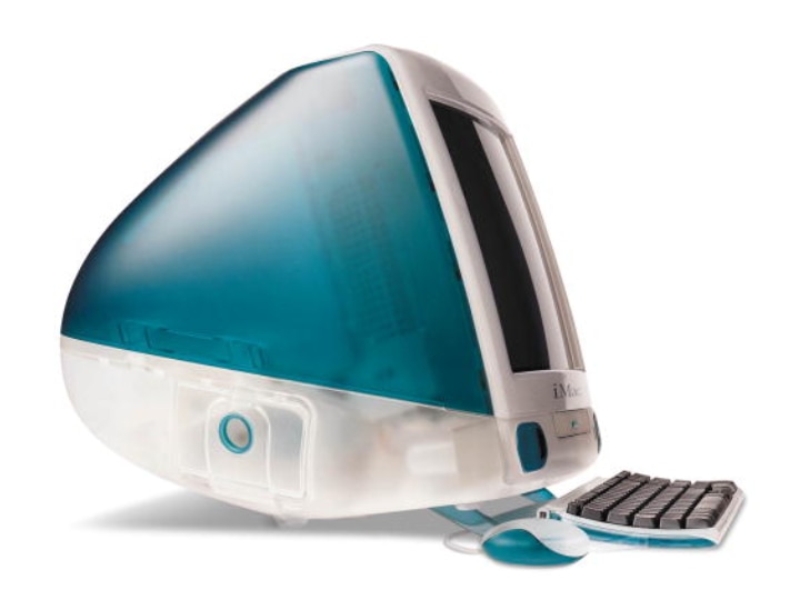
The translucent design language may be making headlines today but Ive actually walked down the translucent back design path more than two decades ago — with a device much bigger than a smartphone or a pair of headphones. For the longest time, computers used to be these big, bulky, boring-looking pieces of technology that only excited geeks. These devices used to be just about specs and numbers while the design was merely all about a grey-ish CPU unit and a display. Until the iMac arrived in 1998.
Described as the computer for the next millennium, the iMac G3 1998 was nothing like the computers that existed then and when you think about it, nothing quite like it exists even now. It broke away from the stereotypical design template of what computers used to be and not only blended the CPU and display into one unit, but also came with a translucent plastic back, wrapped around its back, giving users a sneak peek into the insides of the computer.
Originally launched in Bondi Blue colour, it was later released in ten different colours (even a special Dalmatian model) and went on to become famous as the candy-coloured iMac. Even its mouse was distinct and shaped like an ice hockey puck, and it was transparent as well and the same shade as the iMac. Apart from its distinct looks, the iMac G3 1998 was also the first Apple computer to come without a floppy disc drive, which was then considered a staple at that time and also was one of the first computers to come only with USB connectivity.
Like many of Apple’s innovations, the iMac G3 1998 also faced a lot of criticism, but it went on to be a massive hit, and literally put Apple on the comeback path after many had predicted that the company would shut down.
iPod (2001): A thousand songs in your pocket, and a click wheel too!
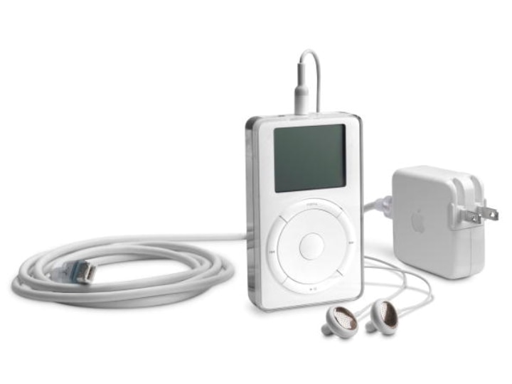
Carrying your whole music library with you was simply not an option before 2001 unless you fancied ferrying box loads of CDs from place to place. Ive and Apple changed that in 2001 with a product that fit in your palm, slipped into your pocket, and truly revolutionised the way people carried, stored, and listened to music – the iPod.
Jobs once famously said that design is not just about how it looks or feels but about how it works. And that is what made the iPod special, the one thing that made the iPod revolutionary. The 5GB MP3 player was Apple's first step on the digital music moon, before going on to dominate the music player market. Yes, there were portable music players at that time too, but there was nothing that looked or worked quite like the device Ive designed.
Inspired by the 1958 Braun T3 radio by Dieter Rams — one of Ive’s inspirations — the iPod 2001 featured a square display below which sat the iconic click wheel. The wheel offered an instinctive way of navigating through the seas of songs that the device could hold — instead of punching buttons as on other devices, you simply rotated or clicked this wheel. Jobs used to insist that the design of a device had to make the users’ lives less complicated.
The iPod did just that. And thanks to all those gigs of storage, it put thousands of songs in users' pockets and put the CD on the path to extinction.
iPhone (2007): ‘An iPod, a phone, an Internet communicator’
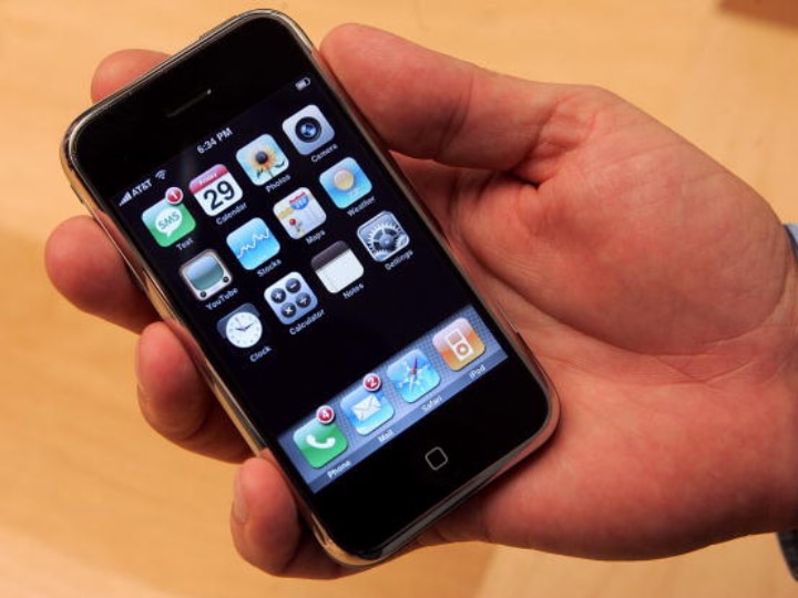
The iMac and iPod were revolutionary, but the most successful and most popular product that Ive ever designed came in 2007. Jobs said while releasing the device, “An iPod, a phone, an Internet communicator” over and over just to put emphasis on all that this device could do and with the aim to “reinvent the phone.”
Apple launched the iPhone in 2007 and phones would never be the same again. The iPhone went on to literally transform the entire industry. Back then, smartphones existed but they were basically tiny screens with big physical keyboards. Phones with touchscreens did exist, but you needed a stylus (or your fingernails) to be able to use them. The all-screen iPhone changed all that. The phone was also incredibly simple to use with everything working by touch.
There was just one button at the front — the home button. Ive's design became an industry standard. All these years later, smartphones are now just one big display. Rarely has a single design become this universal across an industry.
iPad (2010): Making tablets a thing!
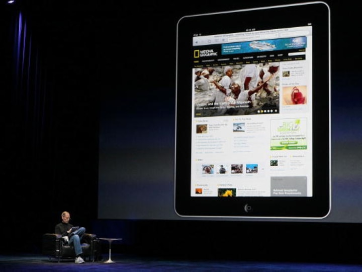
After reinventing the phone, Ive then created the tablet category by literally stretching the iPhone. This expanded version of the iPhone with a tall screen and a home button on the base was Apple’s tablet.
In Apple’s own words, the iPad was a “magical and revolutionary device.” It was the device that slipped into the space between the iPhone and the larger MacBook. Bigger than the iPhone, but much more portable than the Macbook or other laptops, the iPad was perfect for reading, browsing the Internet, listening to music, playing games, sending emails, and all else.
The first generation of the iPad sold over two million products in less than 60 days, triggering a tablet revolution. Although tablets themselves have gone through lean patches, the iPad lineup is still going strong.
It is the most successful tablet lineup ever and as we write, is looking to become a notebook alternative. And like the iPhone, its all-screen design remains largely unchanged since Ive first made it.
Apple Watch (2015): Smarts on your wrist
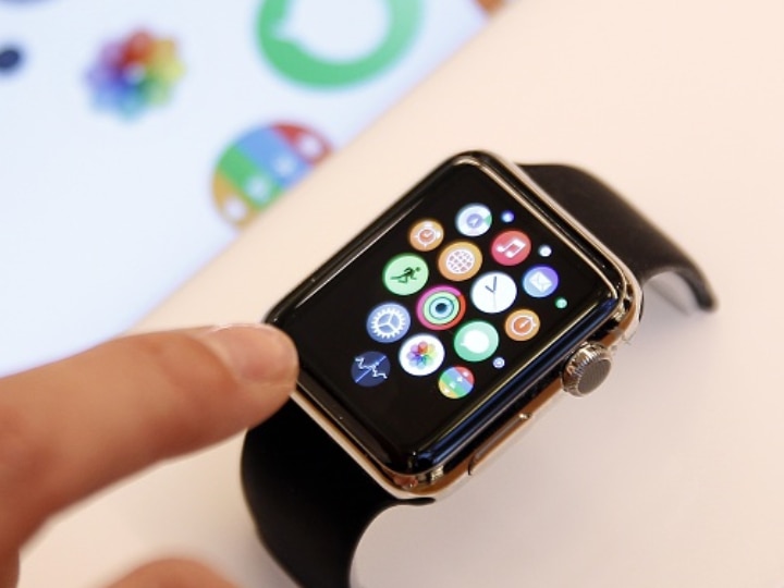
The Apple Watch is considered to be the holy grail of all smartwatches. It sits on your wrist and helps not only stay connected with the world around you but also helps you stay fit and monitor your health.
While smartwatches might seem like an integral part of our daily lives today, when the Apple Watch was launched, it (like many Apple products) faced a lot of criticism because of its design.
Many wondered how they would be able to navigate or see data on such a tiny screen. Others were critical of the Digital Crown and its placement on the watch (near the top, rather than bang in the centre) and still others wondered why it was square and not round. But just like many of Ive’s designs, the Apple Watch not only succeeded but has continued to go strong years after its launch.
The much-maligned Digital Crown on the side was a design marvel that allowed users to not just navigate through the watch, but also let users take ECG measurements in later versions. Users have also realised that the square shape of the watch actually gave them more space to read and view content, as compared to round ones.
Over the years, Apple has added a ton of functionality to the Apple Watch, from the fall-detection feature to the ability to measure ECG to even reminders to wash your hands, but its essential design — that square shape and that crown — remains unchanged. Vintage Jony Ive.
AirPods (2016): Look bud, no wires!
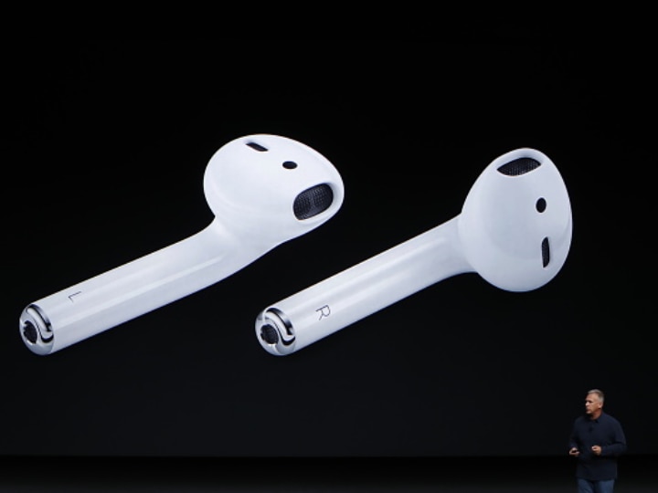
It has pretty much been a Jony Ive (and Apple) tradition to have his new design criticised heavily by the world only to be copied later. While true wireless stereo (TWS) earbuds did exist before AirPods, it wasn’t until the launch of the AirPods that the TWS revolution truly took off.
When AirPods were initially launched many complained that the design was a major letdown and that the AirPods looked exactly like the wired EarPods, only without the wires. But like most other Apple products, the AirPods won over the hearts of the masses, became insanely popular and created a new segment in the audio market.
The white tiny buds came in a squarish, pristine, white case with a small button on the back, light and easy enough to fit into a pocket. Flip the case open and you get to the wireless EarPods nestled magnetically inside.
The buds themselves were a design delight. They had Touch sensors on the pods and had mics at the base of the stem which made them very good for calls. Since the launch of the OG AirPods, Apple has launched other variants of the AirPods variant but by and large has stuck to the design template of the original AirPods, with a few edits.
Sounds familiar? Sounds like a Jony Ive design.
Related Video
Apple creates a new record in iPhone sales after launch of iPhone 16 | ABP Paisa Live


