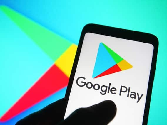
Months after the Google Chrome logo got a design refresh, the Google Play Store logo also got a refresh to mark its 10-year anniversary. With less vibrant colours that now closely resemble the colours yellow, green, blue and red, the Google Play Store has a new logo that complements the new changed Google Chrome logo that was unveiled in February this year.
The new colours are less vivid than the ones in the old version. Google Play's new logo and iconography also celebrate 10 years of Google Play. Google Play was rebranded from Android Market in 2012.
“We’re introducing a new logo that better reflects the magic of Google and matches the branding shared by many of our helpful products — Search, Assistant, Photos, Gmail and more,” Tian Lim, VP of Google Play. The new logo and iconography also mark 10 years of Google Play after it was rebranded from the Android Market in 2012.
“A decade later, more than 2.5 billion people in over 190 countries use Google Play every month to discover apps, games and digital content,” added Lim.
“And more than 2 million developers work with us to build their businesses and reach people around the globe.”
The tech giant is also giving a boost to Google Play Points. "This year marks our 10th year of Google Play-ing. To celebrate, we're offering Play Points members a 10x points boost, starting today. How has it been a DECADE 🤔🤯🤔 Claim your points boost here: https://goo.gle/3AetWxI #PlayTurns10," the company announced on Twitter.
Meanwhile, from 2008 until 2022, the Google Chrome logo has been getting gradually simpler. What started out as a shiny, three-dimensional emblem has been squashed down into a 2D symbol of modernity.
