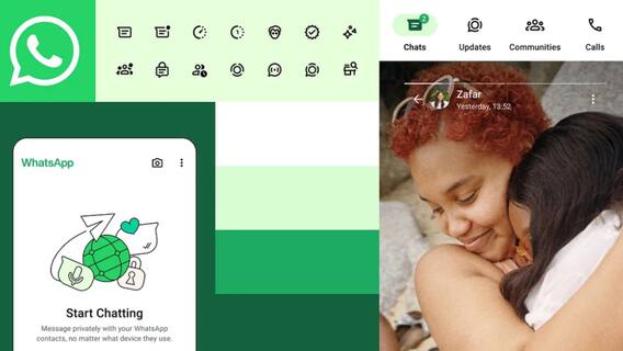
WhatsApp, the Meta-owned instant messenger, has recently introduced a fresh look for its app across both iOS and Android platforms, aiming to provide users with an updated and more user-friendly experience. The rollout of the new interface has commenced, bringing forth several notable changes. Among the key modifications is the revamped dark mode, featuring a darker background to enhance text legibility.
Conversely, the light mode now boasts additional white space, contributing to a rejuvenated appearance and improved user interaction.
WhatsApp Gets New Shade Of Green
In line with its brand identity, WhatsApp has adopted a new shade of green for its colour scheme. Furthermore, the strategic use of colour has been refined to highlight essential elements on the screen, ensuring a more focused user experience.
Icon and button designs have also undergone a transformation, incorporating changes in shape and colour to enhance visual appeal. Additionally, certain sections of the app have been spaced out more generously, thereby improving overall readability and navigation.
New Look For WhatsApp Tabs
Notable adjustments include the introduction of the WhatsApp logo in the "Chats" tab, providing a distinct visual cue within the interface.
For Android users, navigation tabs that were previously located at the top of the screen have been relocated to the bottom, facilitating easier access.
Moreover, the search bar has been repositioned to the top of the "Chats" tab, enhancing its visibility and accessibility for users seeking specific conversations or messages.
How Can Users Get The New Update?
It's important to mention that this update will be gradually rolled out to all WhatsApp users and is mandatory, meaning users cannot opt out of receiving it. While the changes may not be immediately visible to all users, WhatsApp recommends keeping the app updated to ensure access to the latest features and improvements.
